Overview:
Sr. UX Designer on the Acquisitions & Engagement team, lead UX design strategy and implementation in marketing pod and non-pod campaigns. Delivered new digital experiences across multiple digital channels increasing user engagement and conversions. Worked collaboratively in the planning, design, and building of new web channel B2C experiences integrating new AI products (YEXT search, PathFactory) with existing components to leverage content personalization, predictive analytics and provide better insights into customer behavior.
Case Studies / Projects:
Open Enrollment Campaign 2024/2025
Open Enrollment General Awareness Marketing Campaign. Campaign ran for four months, preceeding and overlapping the Open Enrollment period in the United States. Campaign would utilize targeting to promote five specific insurance products and offerings from MetLife. Four of the products and services being targeted would only be eligible for enrollment during the Open Enrollment period and the fifth was for Pet Insurance which was evergreen and being tested to see if we could increase conversions during Open Enrollment. The channels selected to drive traffic across the MetLife ecosystem listed below.
- Paid Search Branded Keyword
- Paid Search Non-Branded Keyword
- Programmatic
- Social Media
Depending on the user and channel a specific product was promoted. Traffic was driffen to either the re-designed Open Enrollment Landing Page, a specific product page being promoted, an article page or to enroll in MetLife's Pet Insurance.
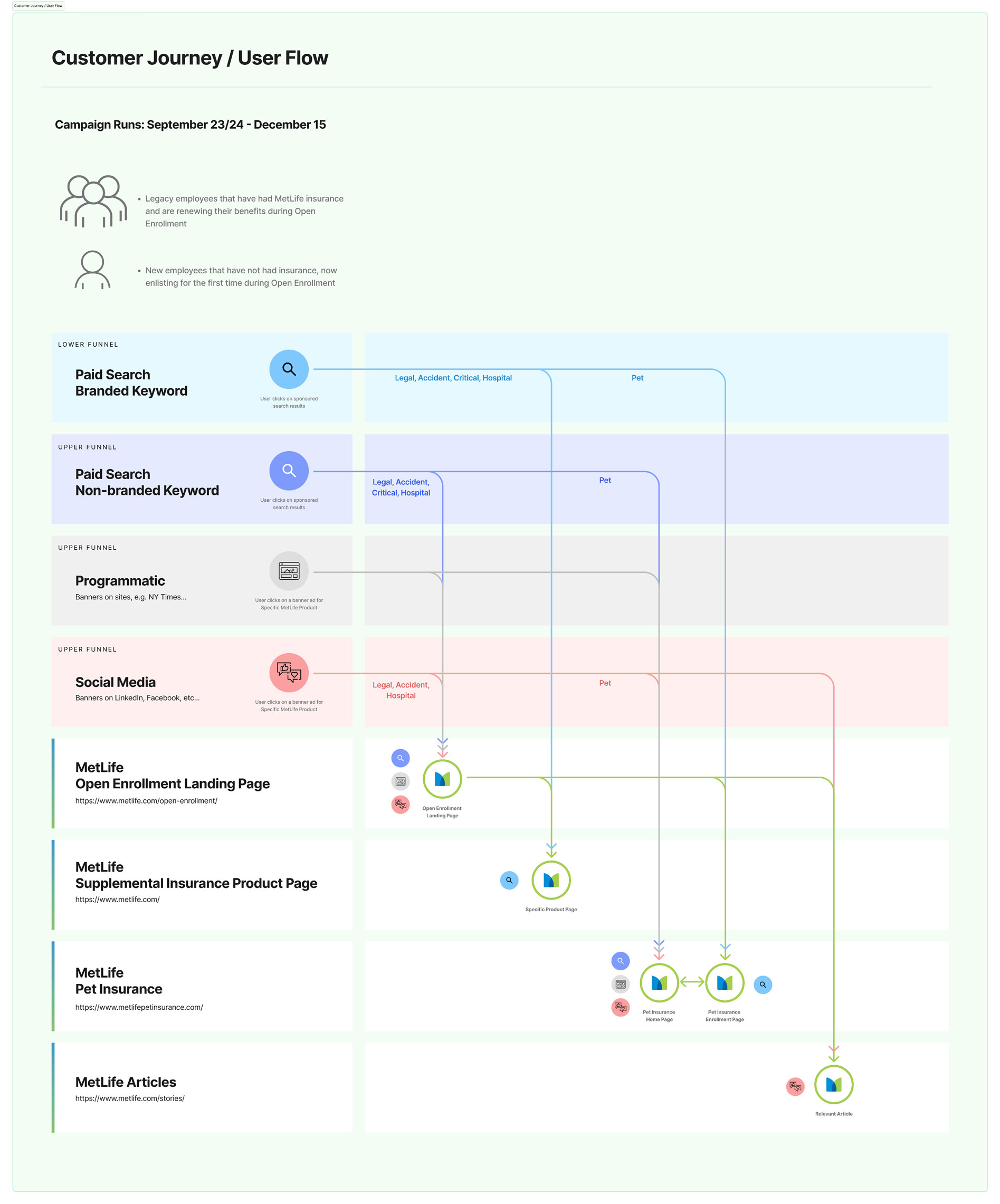
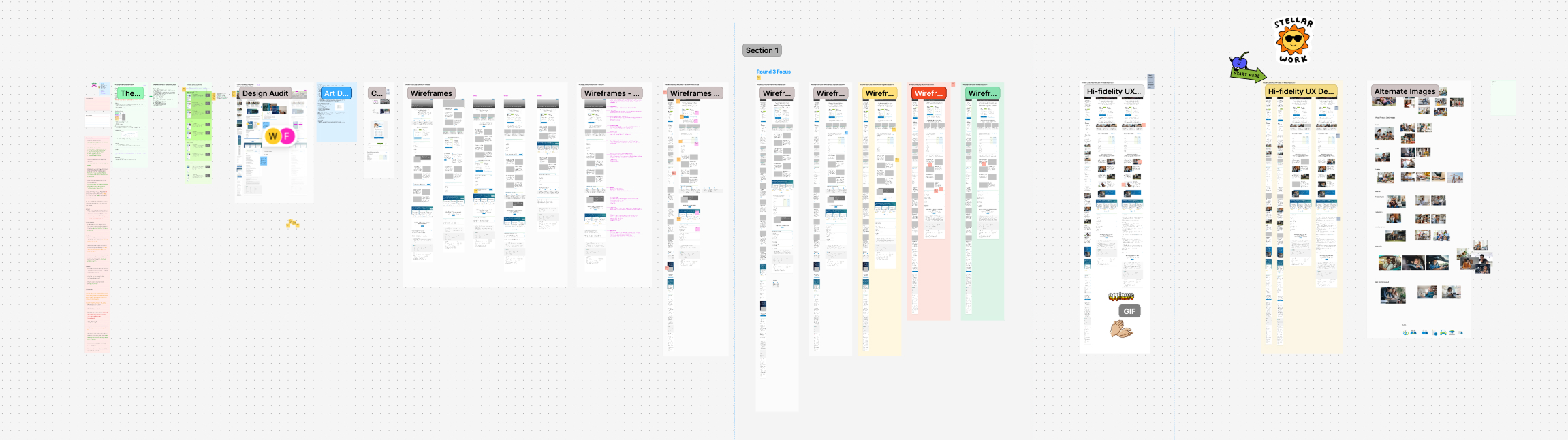
Mapped out User Flows to help visualize the journey and content that a User would engage with.
- Paid Search Branded Keyword
- Paid Search Non-Branded Keyword
- Programmatic
- Social Media
A design audit of the previous years landing page, a review of the campaign and creative assets that drove users to the landing page provided context and gave insight into areas where improvement was needed and new strategies could be invoked. Consensus amongst the team.
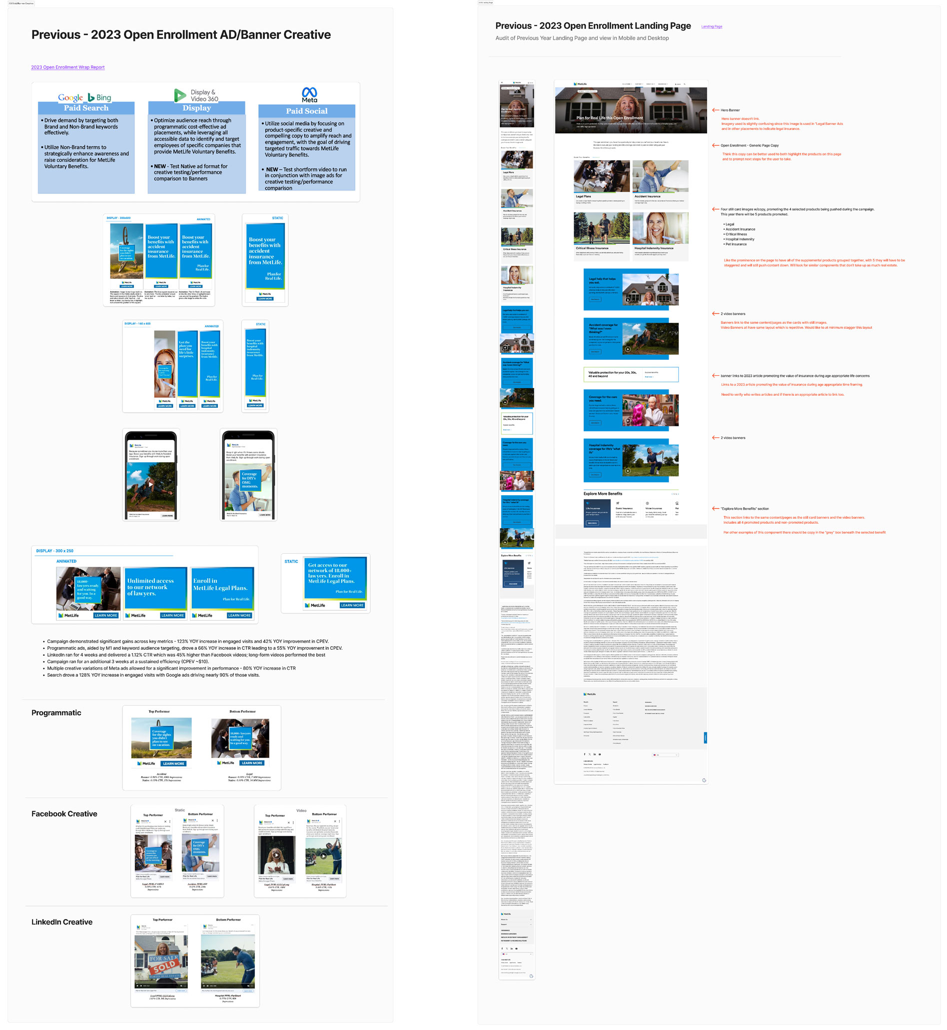
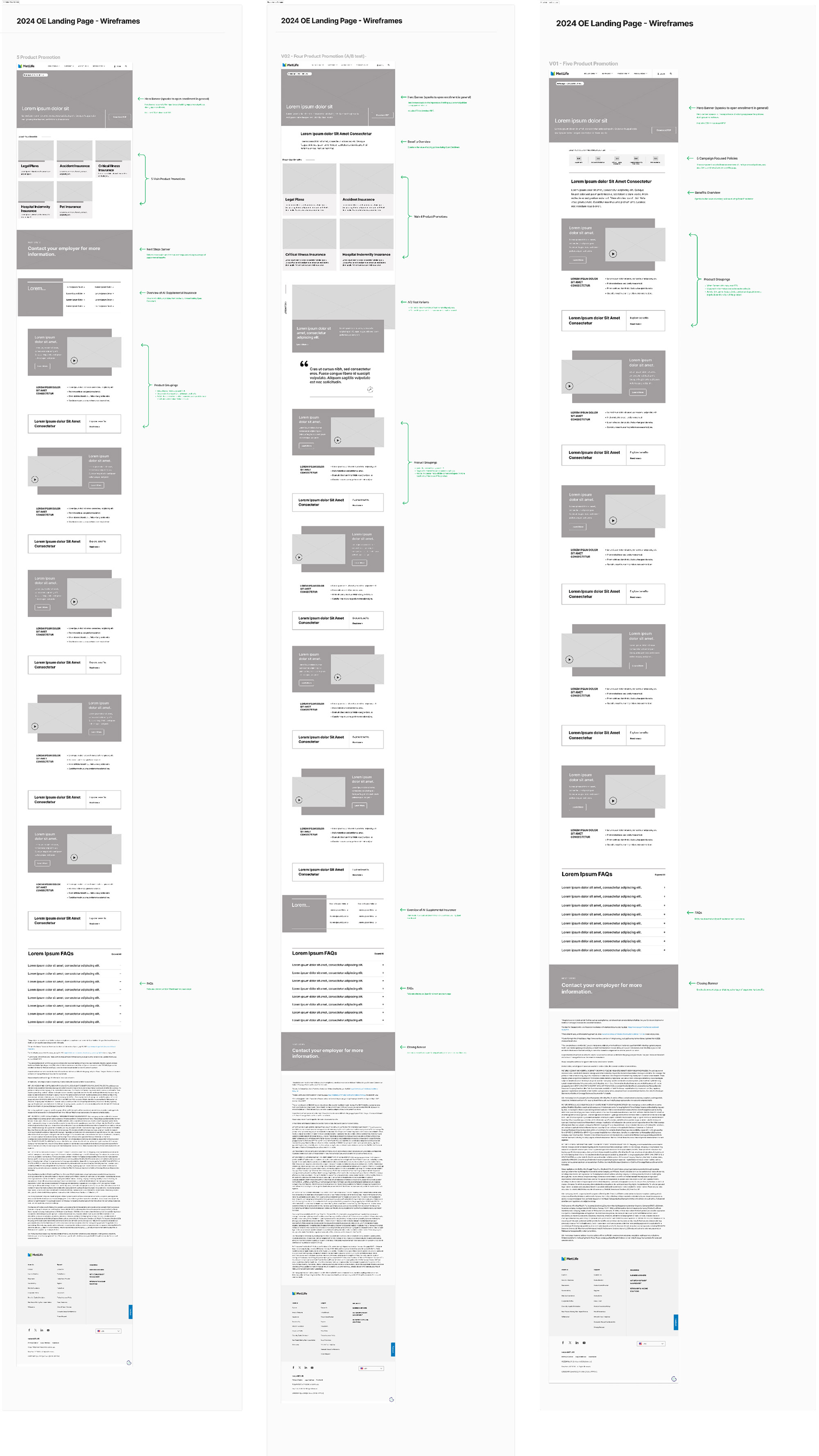
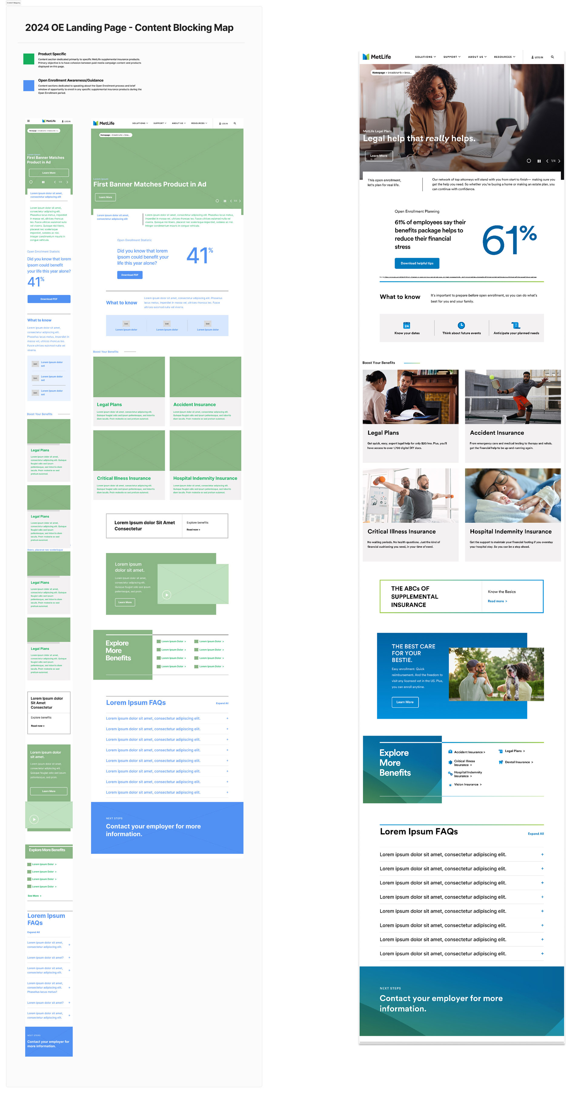
Audit gave insight into better and more informed approach to engaging the user. Goals were to have continuity from paid-content that was clicked on and drove user to landing page - yet be able to introduce to other products user may be eligile to enroll in. Through wireframe iteration and exploration the campaign adopted a strategy of guidance explaining how to take advantage and get the most out of your Open Enrollment Benefit window as well as messaging that informed and educated about the individual products and services.
Copy and image content was being provided by creative agency RTOP. Content map provided to indicate where different tones and messaging guidance should be implemented.
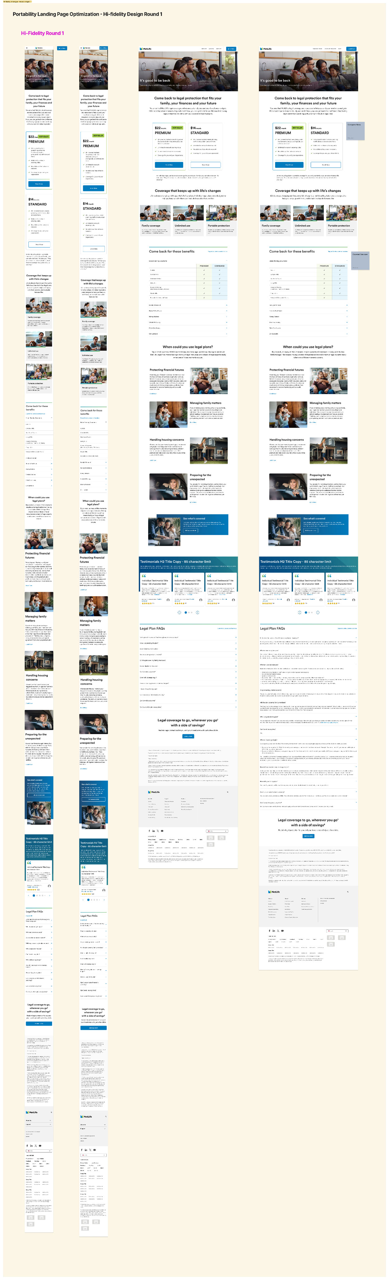
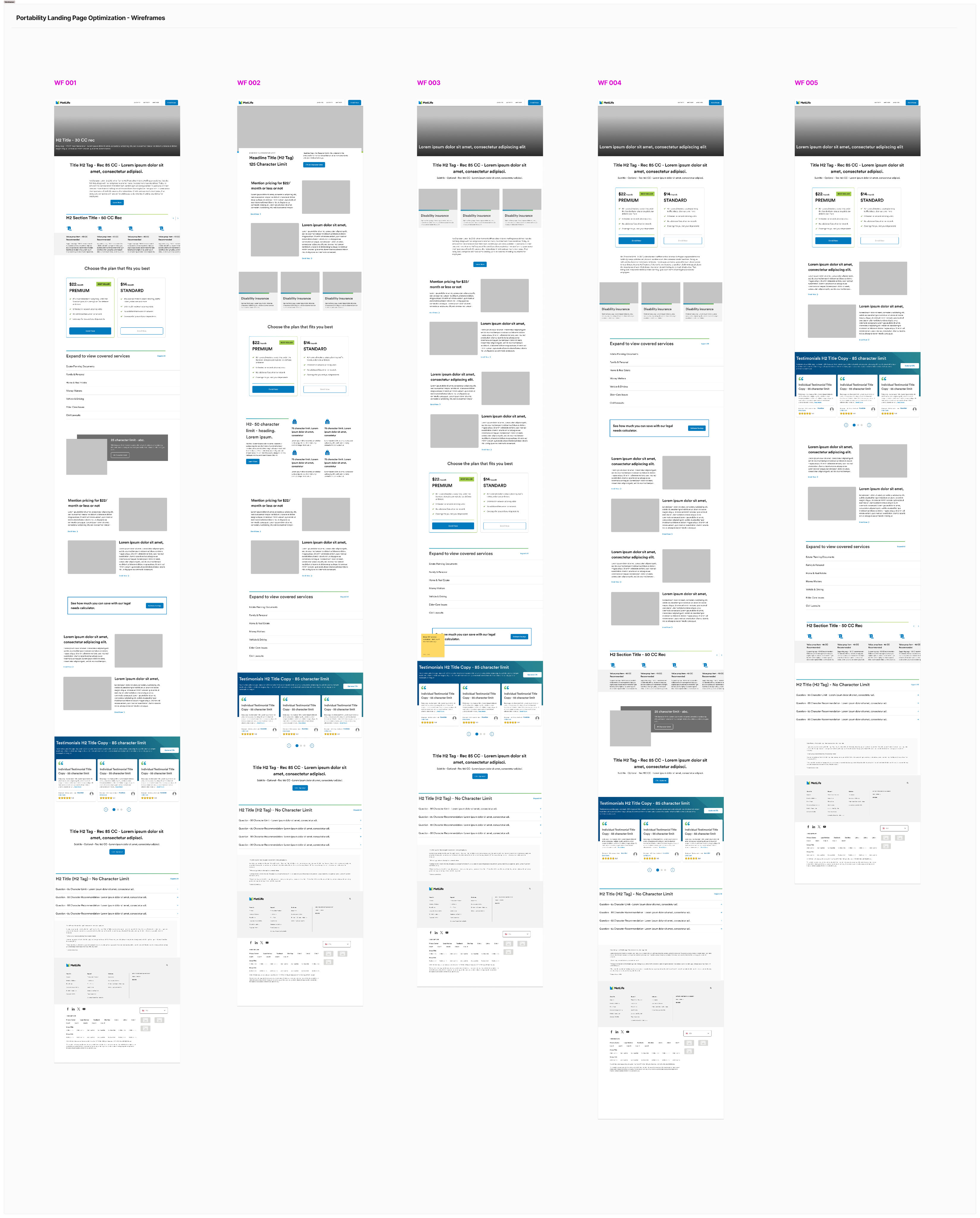
Portability Page Redesign Strategy:
Objective of this redesign was to make former group members aware of their eligibility to enroll in an individual legal plan following their involuntary lapse and drving them to enroll.
Target audience was being driven to Portability page by email. Pulled email creative to perform UX audit, understand relationship between messaging month of deployment, open and click through rate in comparison with list health and email deployment month.
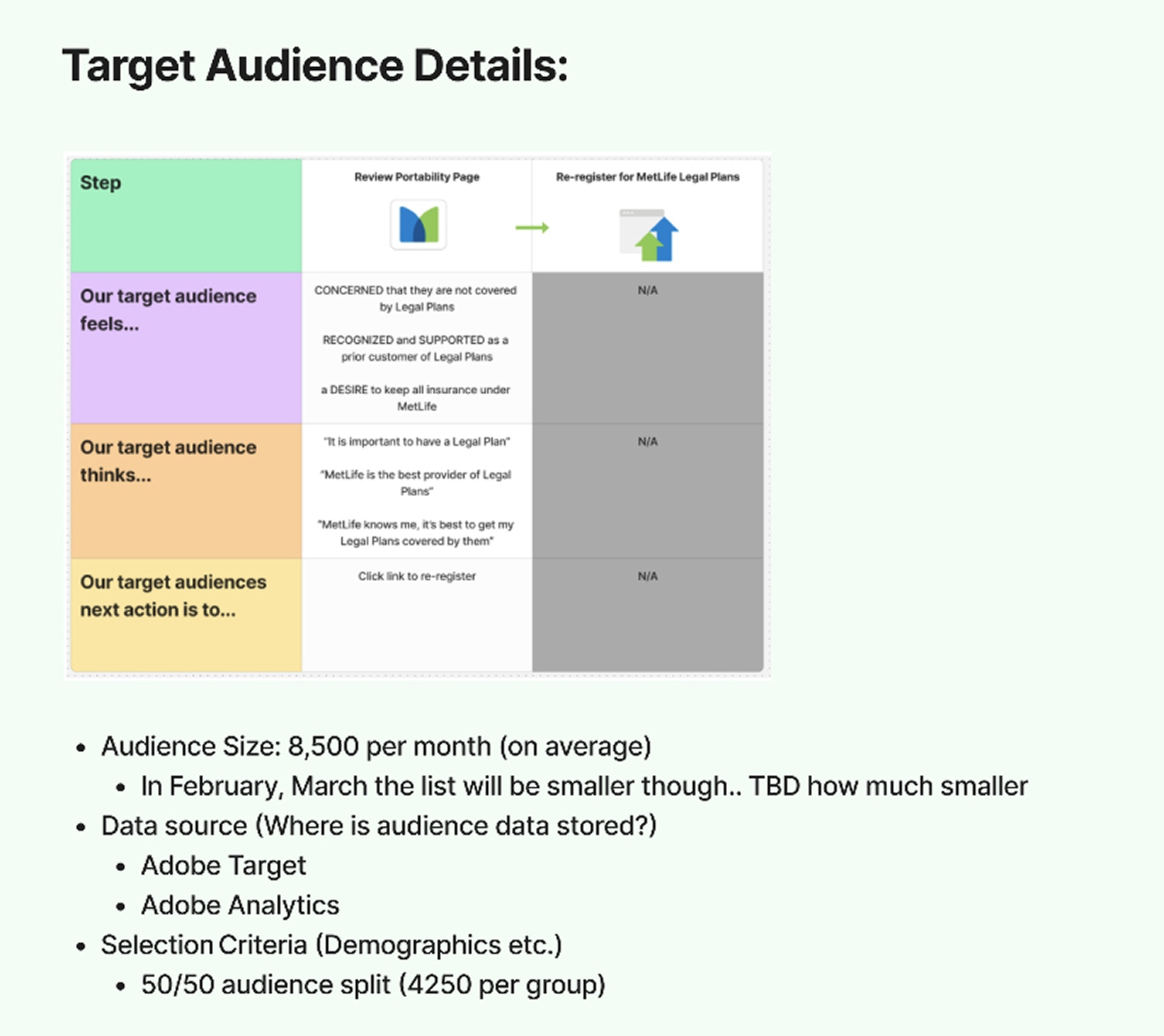

UX and analytics Audit of the existing Portability page provided insight into which content/info was most engaged and being sought after, relevant consistency between email and landing page, missed opportunities to present relevant products in front of target audience, missed opportunities to provide clearer CTA as well as capture better engagement metrics. Optimized placement of content and gateway CTAs on the page.
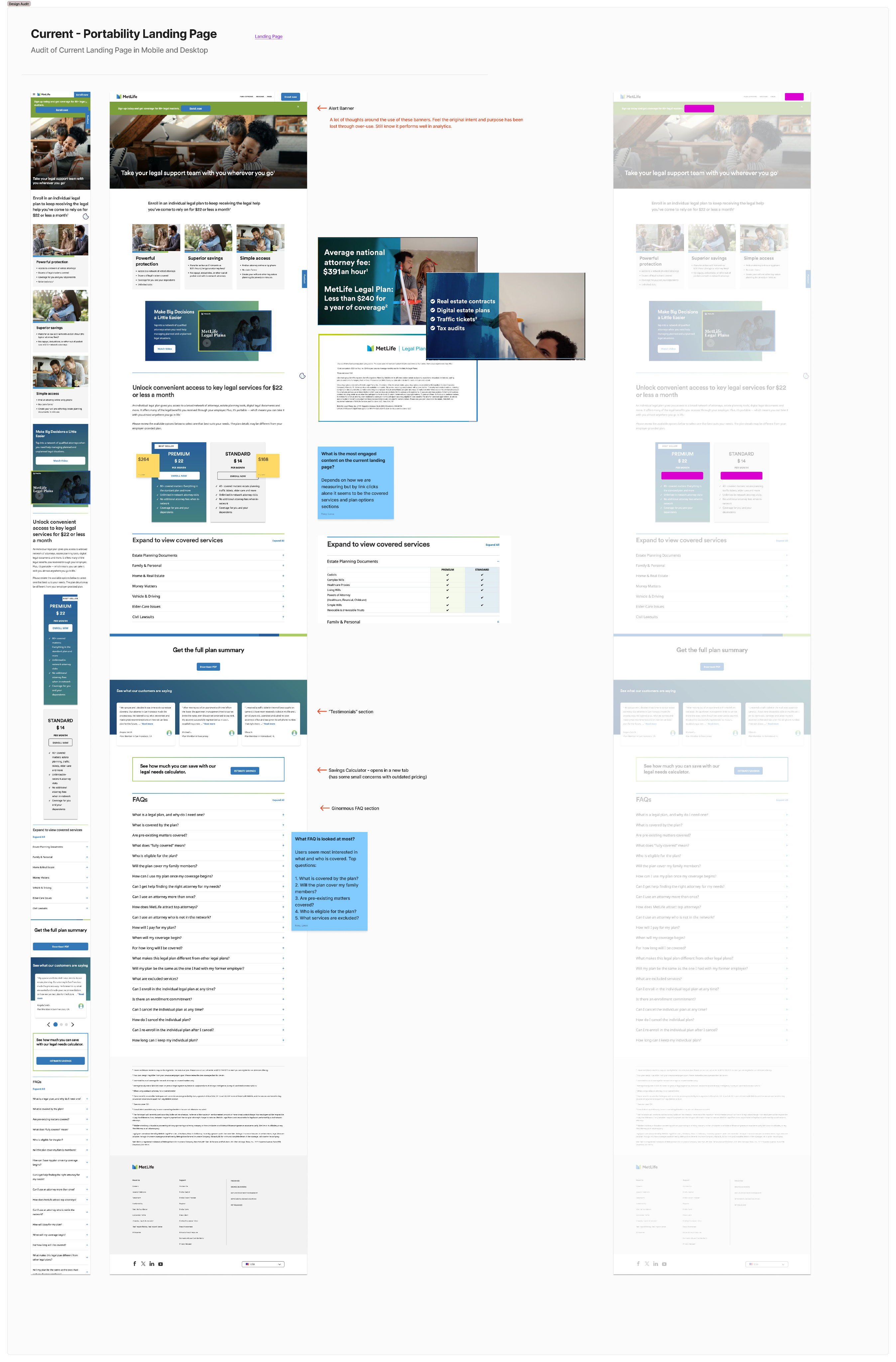
Wireframe options explored the potential and impact of hierarchal layout of content with strong CTAs to drive enrollment at promninent page position regardless of device. Messaging that was found to be highly engaging in UX audit was given consideration to be more prominent on the page and near relevant product promotion with clear path to enroll.
Final content added, submitted for legal approval and shared with dev team for build, QA, and deployment.